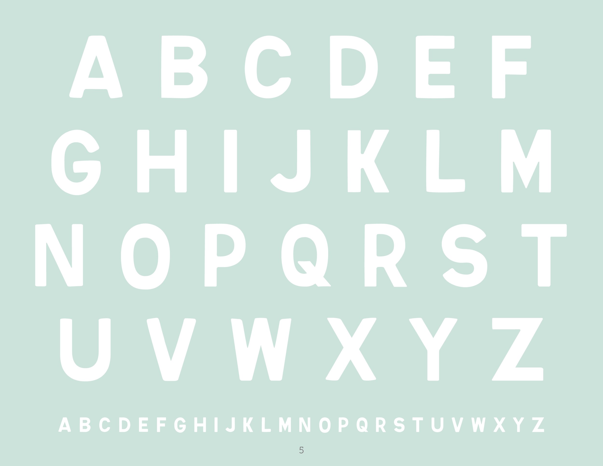
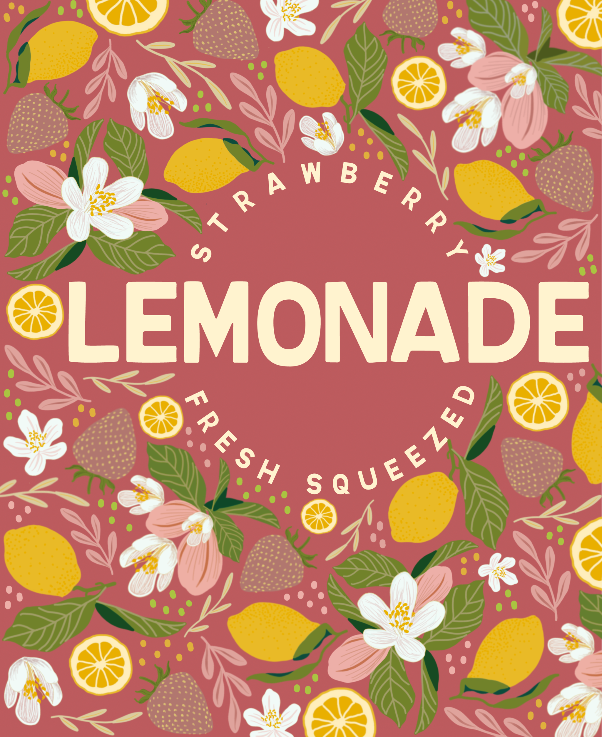
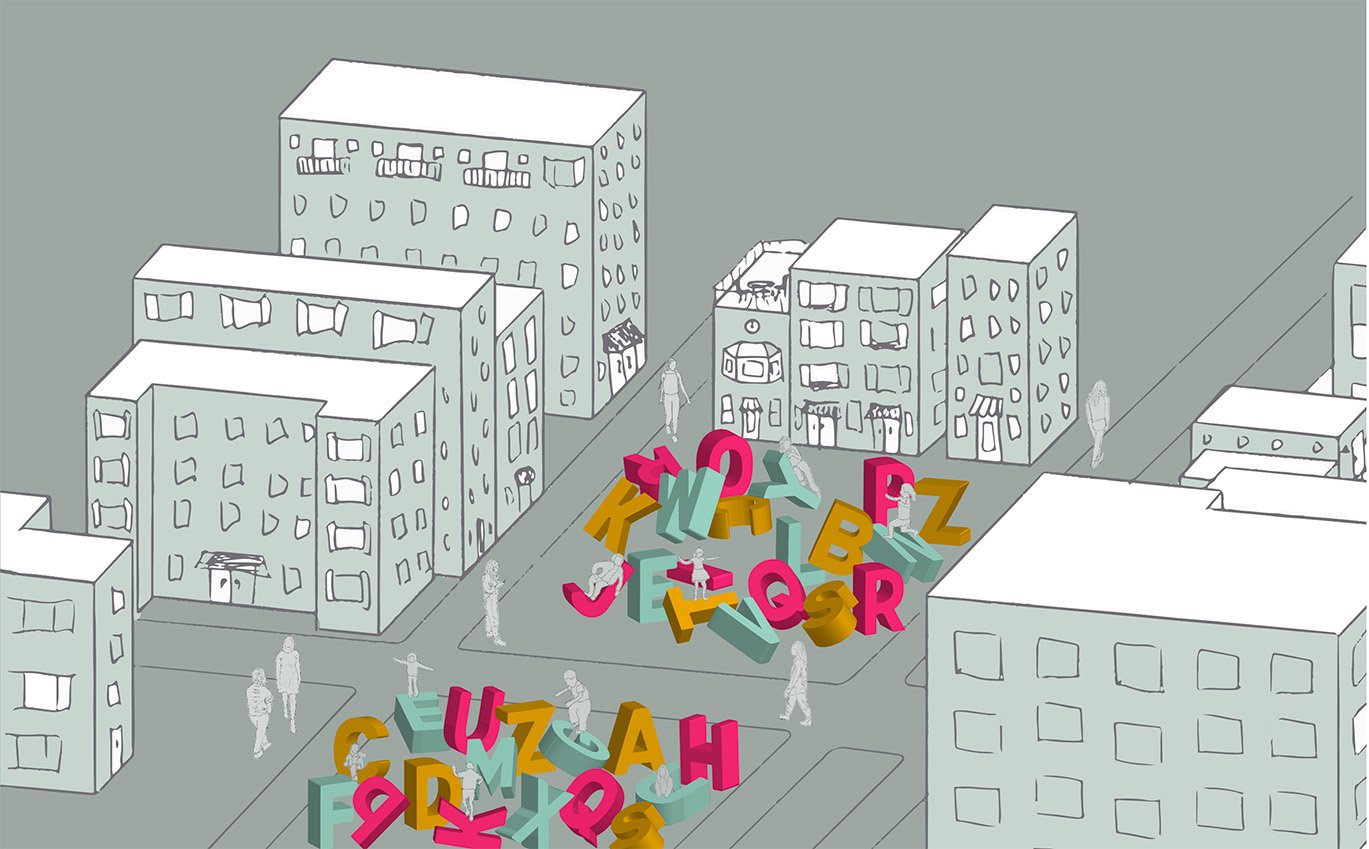
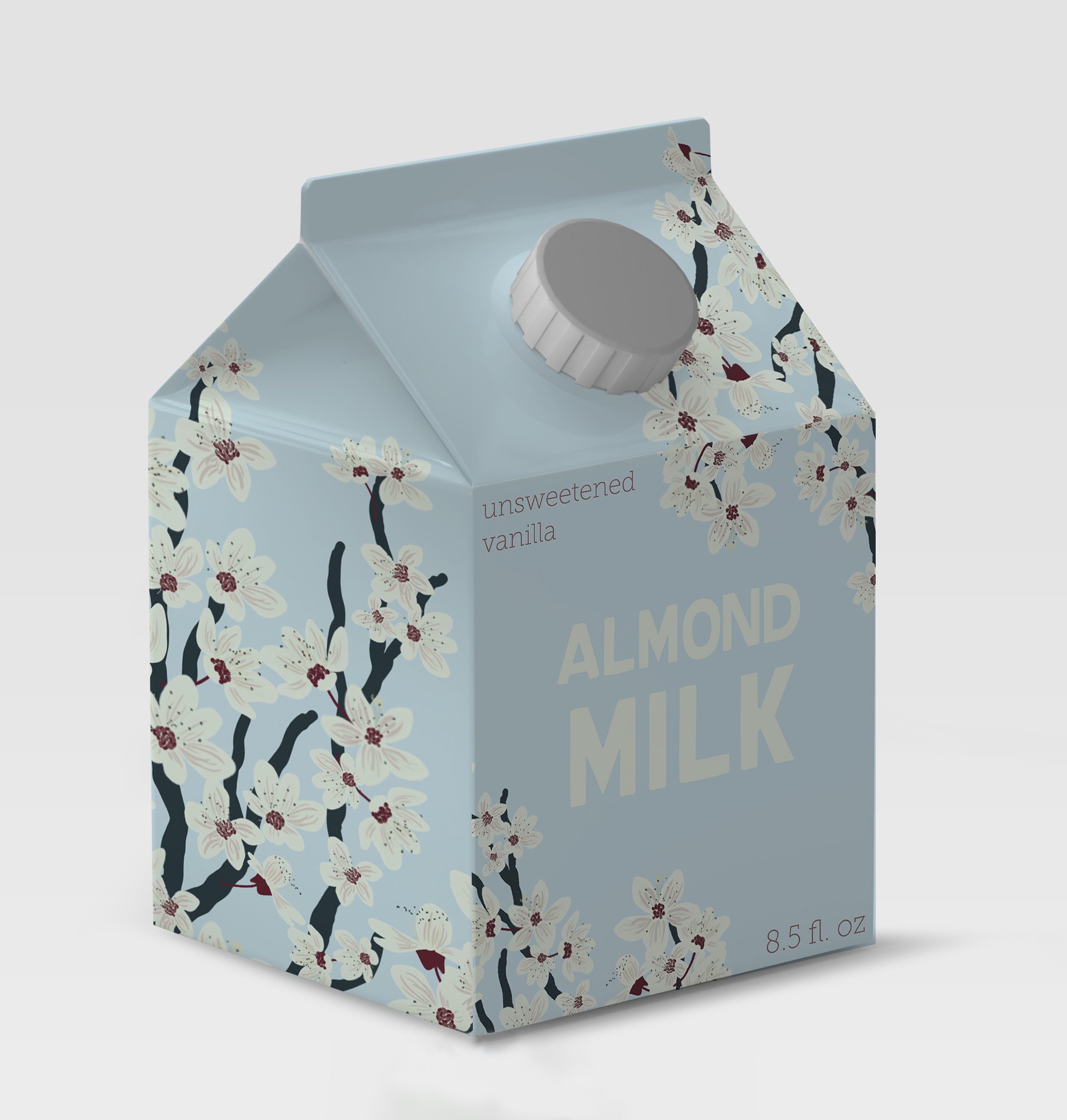
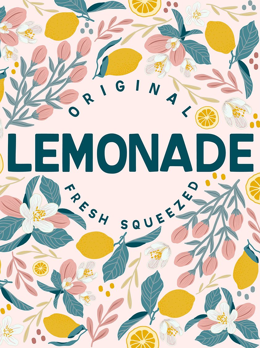
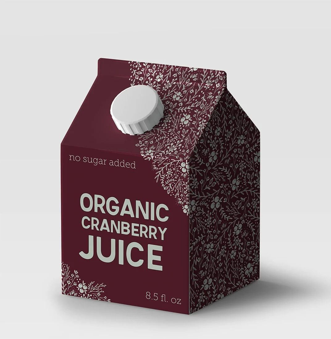
I created this series of packaging pieces to showcase a custom typeface that I designed and titled Playground Regular. The typeface was inspired by hand-painted type that I found at an antique store in Marion, Indiana, and it is a geometric grotesk typeface with a playful personality, designed to feel robust and steady while carrying a flavor of childlike fun. To live up to its name, each type specimen puts a new spin on classic childhood snacks, lunchbox staples, and an exploration of letterforms as the building blocks of an urban playground.